
They’re the heart of the local high community, but small shops are still struggling to compete with big name stores.
That’s despite the fact that, when we asked consumers1 if they preferred shopping locally or in big chain stores, only 8% of respondents opted for big name brands.
But to keep your customers coming to your small store over a big high street competitor, making sure you have a place people will want to shop in is a good place to start.
To help, we spoke to interior designer Lynne Lambourne to get her expert tips on making sure your store is working for you – from creative traffic-stopping window displays to making the most of your floor space.
Window displays
“Tell a visual story with what you use.”
How can small retailers create a really eye-catching shop window display?
Window displays are the most powerful tool available to retailers. A great window display is a low-cost marketing tool that almost every retailer has easy access to. All you need is a little imagination, creativity and regular display changes that will keep people engaged and interested in what you are selling.
Tell a visual story with what you use. The passer-by needs to quickly be intrigued by what you sell. Although it’s great to be creative, you need to make sure your products aren’t being lost among the props and design of your windows. Your window display needs to tell passers-by key information about your shop and your products within the space at first glance.
That said: creating a spectacle which stops people in their tracks and makes a talking point will certainly get you noticed. This is an idea that the big shops use all the time. They create a spectacle in their windows that draws people to visit them each and every year. Think of Macy’s in New York and Selfridges and Liberty in London. It’s a great idea and something that can be done by all shops to create a buzz. Once the shoppers are there checking out the window, it’s likely they’ll pop in too.
Recently I’ve seen a trend for shop windows to feature lots of plants along with the usual products they sell, both at ground level but also in hanging baskets and sometimes planted in fun and unusual containers. Somehow it just brings the window alive. The use of greenery helps promote health and wellbeing and they can soften the look of quite an otherwise bland space. Stores like Anthropologie are very good at incorporating plants within their displays both in the window and in the form of living walls within the shops. I think it can help lighten the shopper’s mood, plants genuinely make people calmer and happier so this can only help increase the enjoyment of the shopping experience. Make a unique display in the shop and add some fun at the entrance using plants – it’s an easy and affordable styling idea.
Using your space
“Use a focal point and angle your mirrors toward it to give the illusion of depth.”
Small retailers often don't have the luxury of a lot of square-footage, so how can they make their stores feel larger than they are?
A small shop and a lack of square footage means that you need to be creative with the space that you have. Building cupboards or shelving units can double the display space that you have immediately and this need not cost a fortune. I love to use vintage apple crates as they not only fit together easily to create a great visual, but actually have lots of space in them to store things too.
The texture of the old wood can also add a feature to the shop, as many places do not have many ascetical design features. I made a display unit late last year for Pierrpoints, a café in Goring, they not only sell the most amazing cakes but also support small local creatives. They wanted somewhere where they can display the creative work to sell without it talking up too much of the floor space. You can design your own configuration with apple crates that would suit your needs best and then very easily screw them together. If you want to be able to move them easily, just pop some castors on the bottom.
My local florist White Garden also uses crates to achieve great visual results. This is their valentines display it has a real wow factor. The use of crates is so much more interesting than boring plain shelves.
While it’s true that painting a whole space white will make it look bigger there are other tricks that you can use. Keep flooring dark and walls light and the floor space will appear to expand and try to keep the ceilings in a light colour to create height on the space. I always think painting the whole shop in one light colour works best as it enables your eye to travel continuously around the space, making the room appear more spacious. When you use different colours, your eye stops at the line where the colour changes and you see the boundaries. With the same colour, you don't see boundaries and space seem to continue.
Mirrors can make your room look larger. Use a focal point and angle your mirrors toward it to give the illusion of depth. Mirrors also reflect both natural and artificial light to make a room brighter during the day and night. They bounce light deep into the room, making it appear larger. Popping a mirror near a window to reflect the outdoors is especially effective and if you don’t have much wall space don’t forget you could have mirrors on the back of shelves or on cabinet doors too.
Try not to block off the windows as this stops the natural light, which always gives the illusion of a bigger space. If people can see through to the shop from the window it also makes it feel larger and I think makes it much more of a welcoming feel for the customer.
Point of purchase displays
What extra special things can retailers do to make the till area more than 'the place you hand over your money'?
Till areas are important – it’s where the point of contact is for customer service and where the customer makes the transaction. That makes it a great area to showcase future promotions or other services that you may offer and also to display much smaller things that could become impulse buys.
A till area can easily be made to look very creative and interesting. I’ve seen things such as pallets used or upcycled vintage furniture such as an old desk or even school science lab desks.
Plants made into living walls on the front of the tills again can add a great deal of interest for not much money. I think styling of this area is key but it can’t be too cluttered, as space is needed for the wrapping and bagging of the items, plus the card machine and till.

Space-saving displays
And if you have limited shelving area, how do you show off a lot of stock in a limited space, without making it look cluttered?
Apple crates and ladder shelves are two of the best things to create shelf space and add interest to the space on a budget. If you are clever you can also use really interesting things such as wooden sledges or vintage chairs as places to display things. A vintage ladder can be purchased on the cheap and then shelves places on it to make a real feature.
When displaying your stock, try to group them neatly so that the shopper does not become confused and so it doesn’t give the feel of a junk shop. Don’t over clutter the space – it’s one of my big bug bears. When I enter a shop and there just seems to be too many things all in one place, I get fed up and leave. I want to see what they are selling clearly and easily, otherwise it’s too much work to shop.
Exterior
“Don’t forget the exterior. It's the first thing people see.”
And finally, what about the outside of the store? Any tips or advice to help this area stand out?
Don’t forget the exterior of your shop, as this is what will ultimately be the first thing people see. Make sure it’s clean and tidy, the windows need to sparkle and any litter be collected in. It’s fantastic when someone takes the time to make a mini garden or pop window boxes at the front of the shop. It shows they care. White Garden Florist in Henley on Thames show how you can grab attention and have amazing curb appeal by turning the front of the shop in to a giant display of their products.
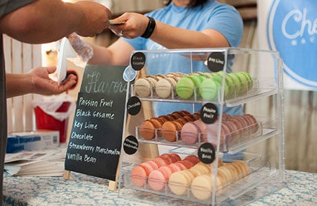
A sandwich board or blackboard is a fantastic idea too – I’ve seen some fantastic blackboards that grab my attention in fun and quirky ways. A local café near me changes the message on the blackboard most days to grab your attention and make you laugh. It becomes a talking point and can help communicate your messages to your customers.
I’m also seeing a real trend for shop fronts painted in darker greys and blues at the moment. Keeping on trend with interiors fashions is key for your shop front as people will be more likely to want to pop in and purchase as you seem current. It also can give your brand or shop a more exclusive feel. You can see an example of the kind of transformation you can achieve here:
Thought and creativity mean that you can transform your shop into an interesting space with visual impact that will draw your customers in. As I’ve said, it needn’t cost a fortune – think of it as marketing and increasing the enjoyment of the shopping experience for your customer!
More about Lynne Lambourne
Web: https://lynnelambourne.com/
Twitter: @LynneLambourne
Instagram: lynnelambourne
Running a shop isn’t easy. Protecting it is.
Whether your shop is brand new or a high street stalwart, we’ve got you covered with our shop insurance for retailers.
There’s no need to shop around – it’s insurance you can tailor to your store’s needs.